
Geo Spatial Analysis
Why Geo based analysis is good!
A Picture speaks a thousand words, Visualisations are great in understanding information which are otherwise hard to grasp in textual or tabular form and importantly they have less cognitive load on the audience.
Companies have been traditionally using visualisation for various things from monitoring KPI, KRI’s to conveying key insights to the stakeholders. While traditional bar charts, and scatter plots are good in conveying information, they lack the modern use cases and simplistic in nature.
If you want to scale your analysis beyond basic numbers to location based intelligence, the traditional plots fail you. And this is exactly where Geo based visualisations could be useful to better understand and extract more insights. It also boosts the audience engagement as it is familiar and easy to understand.
Geo based visualisations takes vast amount of use cases starting from understanding the claim risks across locations in Insurance, Anticipating the likely demands in delivery companies to plan better projects and infrastructure for public needs.
On being said that, for the rest of this article I am going to show some simple yet highly intuitive visualisations to explain how geo based visualisations could be a great asset.
Please note, The maps are created using data from: smartdublin.ie
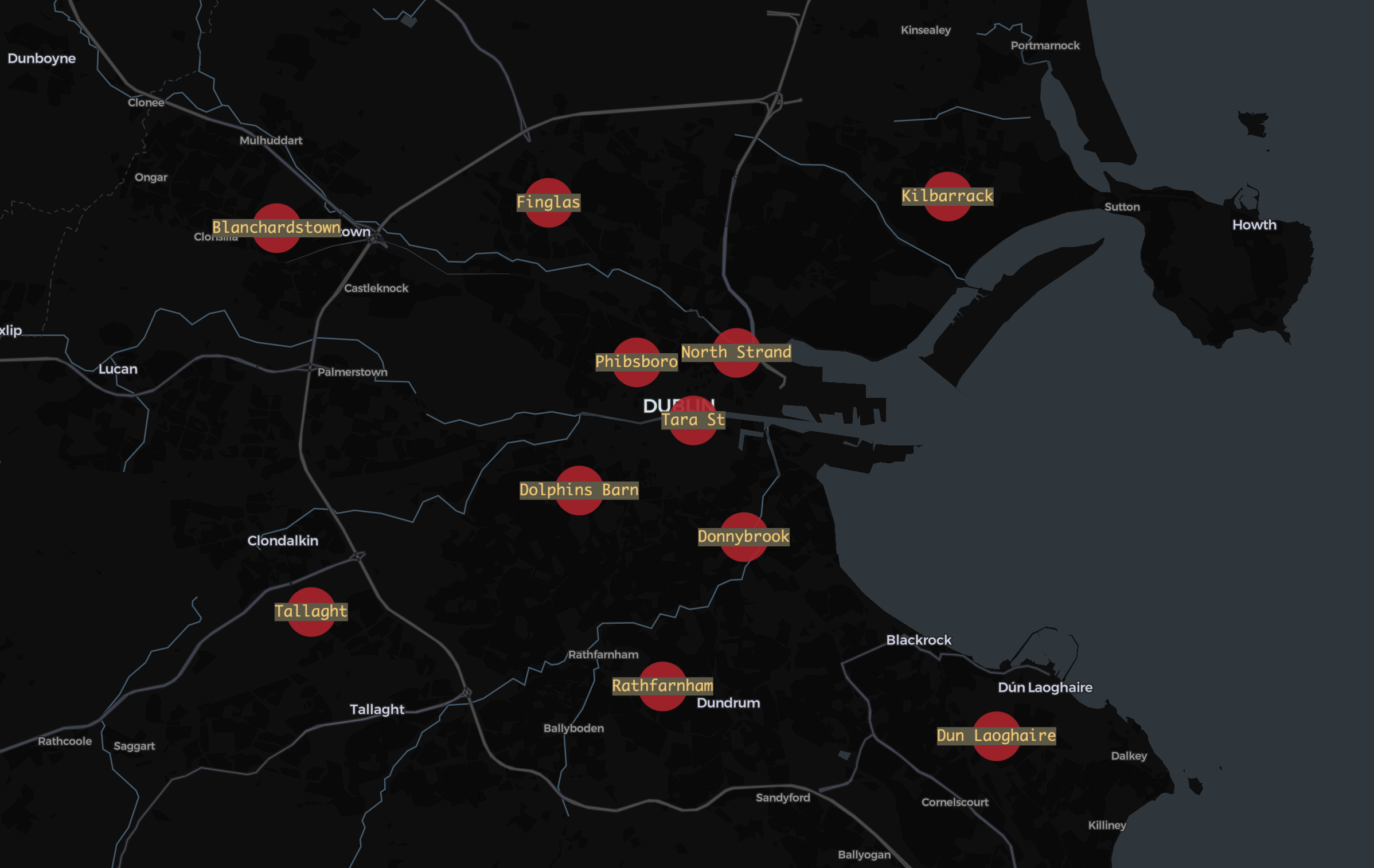
1. Fire Stations in Dublin
This simple map depicts the number of fire stations and its location in Dublin.
2. Traffic Lights
This map shows the Location of 241 CCTV traffic poles within Dublin City Council administrative area. Traffic system in Dublin is based on a combination of both SCATS and Traffic signals or just the traffic signals(Traffic lights).
SCATS(Sydney Coordinated Adaptive Traffic System) is an adaptive urban traffic management system that synchronises traffic signals to optimise traffic flow across a whole city, region or corridor.
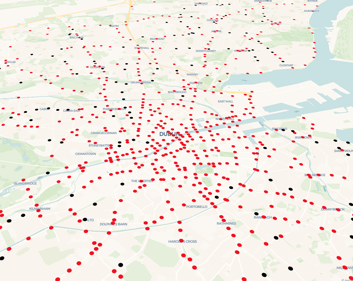
Red dots on the map denotes that both SCATS detectors and traffic signals (traffic lights) are present and Black dot refers the Signal Site with just the traffic signals. There is a large cluster of traffic lights with SCATS in Dublin city, and the dots are quite agreeing to the painful experience of driving through the city.
3. Dublin Bikes
Dublin Bikes is a bike sharing scheme in operation from bicycle docks and stations in Dublin City. 2023 full year data is gathered to understand the availability of bikes at different locations.
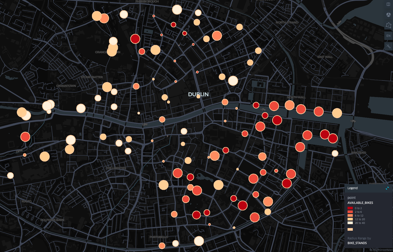
The size of the circle shows number of bikes stands the location has and the colour shows the average number of bikes were available in 2023. The darker the colour the less bikes were available in the stand.
The bike stands close to Ringsend has one of the highest number of bikes and they are the most busiest one. If you are looking for a Dublin bike closer to Ringsend your chances of getting a bike is very low.
4. Google Project Air View Data
This data was collected by Google and Dublin City Council as part of Project Air View Dublin. Google’s first electric Street View car equipped with Aclima’s mobile air sensing platform drove through the roads of Dublin City measuring street by street air quality.
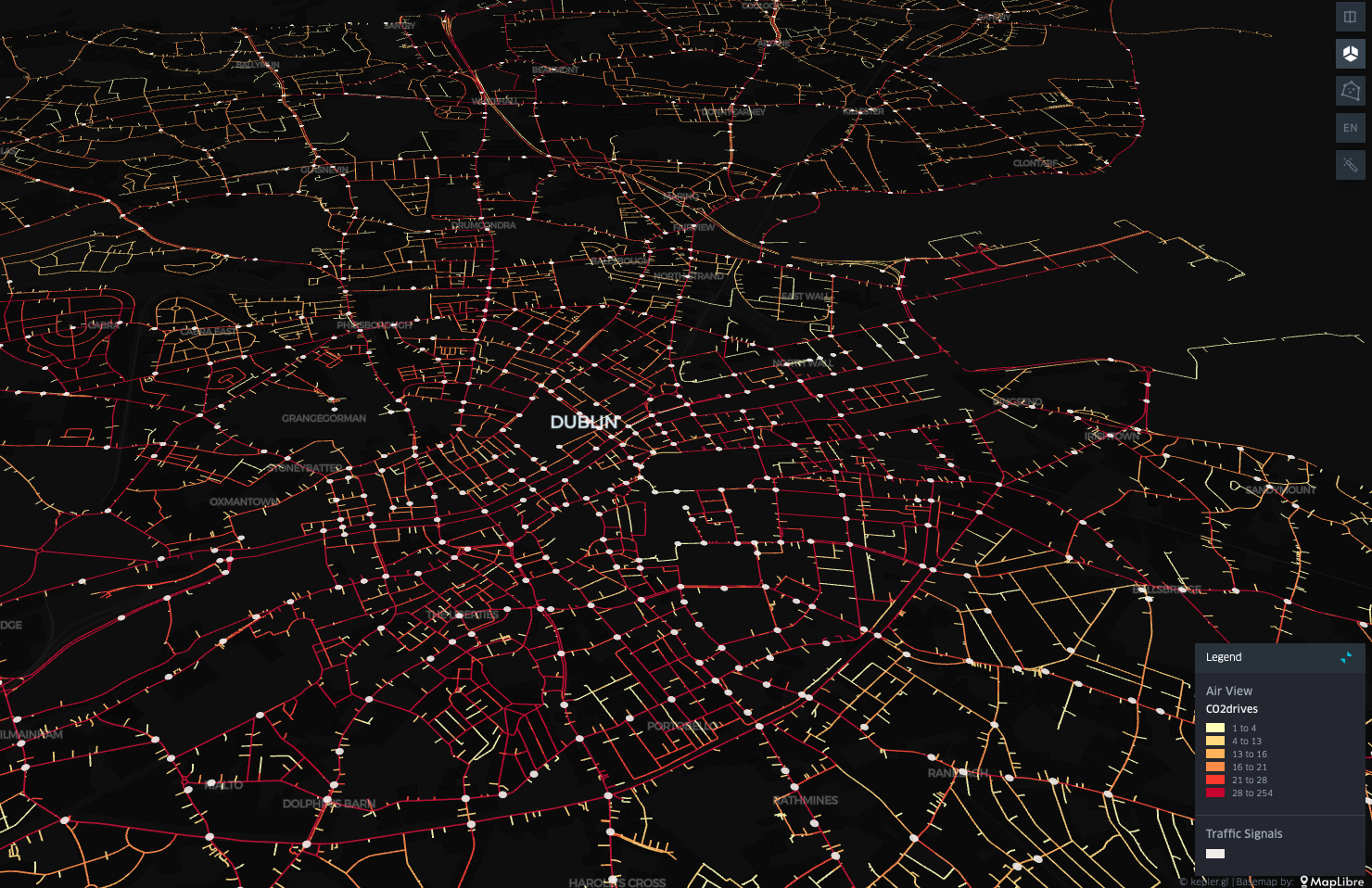
The monitored CO2 levels are displayed with colour scheme from light yellow to dark red denoting low to high CO2 emissions. The area closer to city centre has one of the highest CO2 emissions due to large volume of vehicle commute. Promoting public transports and pooled service would help in reducing the emissions.
These maps are just the simple use cases of how intuitive the Geo spatial analysis could be, Hope that explains the need of Geo based visualisations, Thank you!