
Data Science Salary Analysis
Deep dive into Data Science salaries across the world.
Data Description
-
work_year : The year the salary was paid.
-
experience_level : The experience level in the job during the year
-
employment_type : The type of employment for the role
-
job_title : The role worked in during the year.
-
salary : The total gross salary amount paid.
-
salary_currency : The currency of the salary paid as an ISO 4217 currency code.
-
salaryinusd : The salary in USD
-
employee_residence : Employee’s primary country of residence in during the work year as an ISO 3166 country code.
-
remote_ratio : The overall amount of work done remotely
-
company_location : The country of the employer’s main office or contracting branch
-
company_size : The median number of people that worked for the company during the year
Importing Necessary Libraries
import numpy as np
import pandas as pd
import matplotlib.pyplot as plt
import seaborn as sns
import os
from wordcloud import WordCloud, STOPWORDS, ImageColorGenerator
import warnings
warnings.filterwarnings("ignore")
Reading CSV
#Reading data file
ds_salaries = pd.read_csv("../input/data-science-job-salaries/ds_salaries.csv", index_col= "Unnamed: 0")
#head of the data
ds_salaries.head()
EDA
# Analysis of Job Title
jobs = pd.DataFrame(ds_salaries.groupby("job_title").count()['work_year']).sort_values(by = 'work_year', ascending=False)
plt.figure(figsize=(15,10))
sns.set_style('darkgrid')
sns.barplot(jobs.index[:7],jobs['work_year'][:7],palette='viridis')
plt.xlabel("Job Type")
plt.ylabel("No of People")
plt.title("People by Job Type");
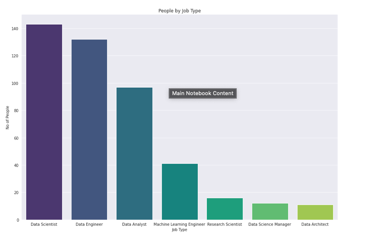
- Most of the Employees are Data Scientist
- Followed by Data Engineer and Data Analyst
Word Cloud for Different Job Titles
text = " ".join(ds_salaries["job_title"].values)
# lower max_font_size, change the maximum number of word and lighten the background:
wordcloud = WordCloud(max_font_size=50, max_words=100, background_color="white").generate(text)
plt.figure(figsize=(15,10))
plt.imshow(wordcloud, interpolation="bilinear")
plt.axis("off")
plt.show()

Employment type and Employment Residence
#Employment type and Employment Residence
job_type = pd.DataFrame(ds_salaries.groupby("employment_type").count()['work_year']).sort_values(by = 'work_year', ascending=False)
plt.figure(figsize=(15,5))
## Analysis of Job Title
plt.subplot(1,2,1)
sns.set_style('darkgrid')
sns.barplot(job_type.index[:5],job_type['work_year'][:5],palette='winter')
plt.xlabel("Job Type")
plt.ylabel("No of People")
plt.title("People by Employment Type");

#Analysis of employee residence
plt.subplot(1,2,2)
emp_res = ds_salaries.groupby("employee_residence").count().sort_values(by = 'work_year',ascending=False)['work_year']
sns.set_style('darkgrid')
sns.barplot(emp_res.index[:5],emp_res.values[:5],palette='viridis')
plt.xlabel("Country")
plt.ylabel("No of People")
plt.title("People by Employment Residence");
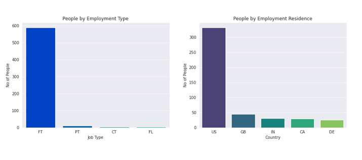
- Most of the Employees are working under Full time role.
- While few employes are doing Part time, Contract, and Free lance jobs.
- Majority are residing in US.
- Followed by Great Britian, India, Canada, Germany.
# Analysis of Job Title
exp_level = pd.DataFrame(ds_salaries.groupby("experience_level").count()['work_year']).sort_values(by = 'work_year', ascending=False)
plt.figure(figsize=(15,10))
sns.set_style('whitegrid')
sns.barplot(exp_level.index[:5],exp_level['work_year'][:5],palette='twilight_shifted')
plt.xlabel("Experience Level")
plt.ylabel("No of People")
plt.title("No of People by their Experience");
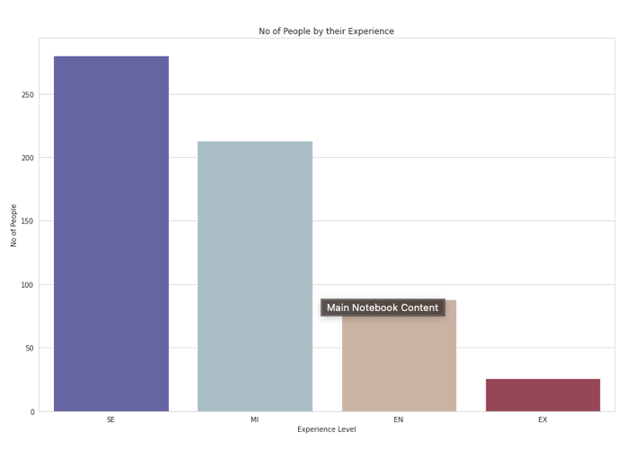
- Majority of the Employees are Senior level, Followed by Mid level Employees.
- Very Few Employees are Entry Level.
- While there are very few executive employee, which is very obvious.
- Because very less people takes up the executive.
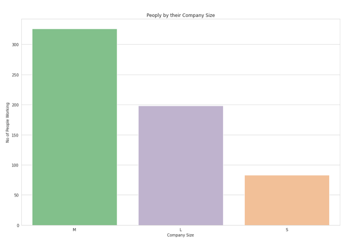
company_size = ds_salaries.groupby('company_size').count()['work_year'].sort_values(ascending=False)
plt.figure(figsize=(15,10))
sns.set_style('whitegrid')
sns.barplot(company_size.index,company_size.values,palette='Accent')
plt.xlabel("Company Size")
plt.ylabel("No of People Working")
plt.title("Peoply by their Company Size");
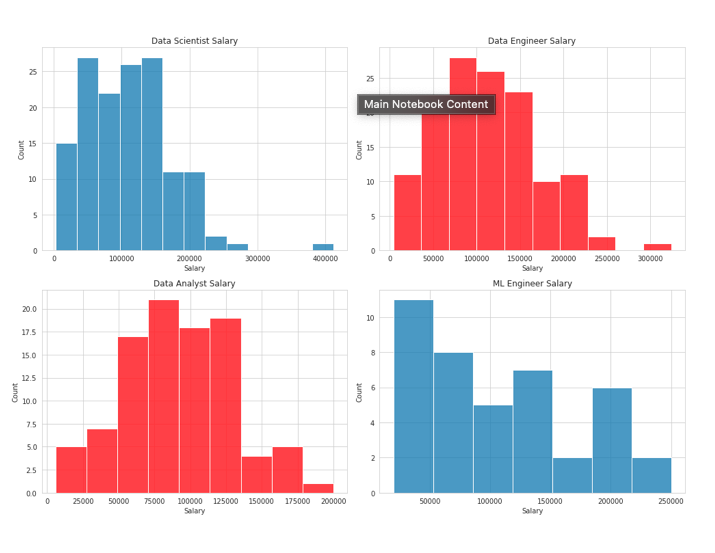
Salary by Job Title
data_scientist_salary = ds_salaries[ds_salaries["job_title"] == 'Data Scientist']['salary_in_usd']
data_engineer_salary = ds_salaries[ds_salaries["job_title"] == 'Data Engineer']['salary_in_usd']
data_analyst_salary = ds_salaries[ds_salaries["job_title"] == 'Data Analyst']['salary_in_usd']
ml_eng_salary = ds_salaries[ds_salaries["job_title"] == 'Machine Learning Engineer']['salary_in_usd']

plt.figure(figsize=(14,10))
#Data Scientist salary
plt.subplot(2,2,1)
sns.histplot(data_scientist_salary)
plt.xlabel('Salary')
plt.title("Data Scientist Salary");

#Data Engineer salary
plt.subplot(2,2,2)
sns.histplot(data_engineer_salary, color = 'red')
plt.xlabel('Salary')
plt.title("Data Engineer Salary");

#Data Analyst Salary
plt.subplot(2,2,3)
sns.histplot(data_analyst_salary,color='red', )
plt.xlabel('Salary')
plt.title("Data Analyst Salary");

#ML Engineer Salary
plt.subplot(2,2,4)
sns.histplot(ml_eng_salary)
plt.xlabel('Salary')
plt.title("ML Engineer Salary");

plt.tight_layout()
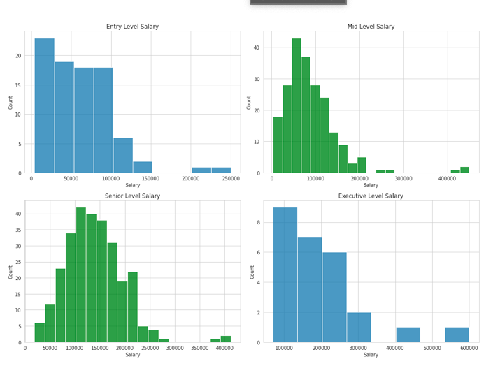
Salary by Experience
entry_salary = ds_salaries[ds_salaries['experience_level'] == 'EN']['salary_in_usd']
mid_level_salary = ds_salaries[ds_salaries['experience_level'] == 'MI']['salary_in_usd']
senior_salary = ds_salaries[ds_salaries['experience_level'] == 'SE']['salary_in_usd']
executive_salary = ds_salaries[ds_salaries['experience_level'] == 'EX']['salary_in_usd']

plt.figure(figsize=(14,10))
#Entry Level salary
plt.subplot(2,2,1)
sns.histplot(entry_salary)
plt.xlabel('Salary')
plt.title("Entry Level Salary");

#Mid level salary
plt.subplot(2,2,2)
sns.histplot(mid_level_salary, color = 'green')
plt.xlabel('Salary')
plt.title("Mid Level Salary");

#Senior Level Salary
plt.subplot(2,2,3)
sns.histplot(senior_salary,color='green', )
plt.xlabel('Salary')
plt.title("Senior Level Salary");

#Executive Level Salary
plt.subplot(2,2,4)
sns.histplot(executive_salary)
plt.xlabel('Salary')
plt.title("Executive Level Salary");
plt.tight_layout()
Highest Salary made?
ds_salaries[ds_salaries['salary_in_usd'] == 600000][['experience_level','job_title','salary_in_usd']]
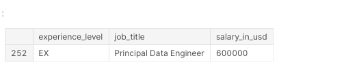 That’s a dope pay!!
Highest and Lower Salary for the Entry Level role.
#highest and lowest and average pay made by entry level
entry_level = ds_salaries[ds_salaries['experience_level'] == 'EN']
entry_level['salary_in_usd'].describe()
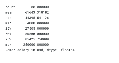
- People are making as low as 4000 USD
- Highest Salary is 250000 USD Which is quite impressive for an entry level job
Who is the Person with 4000 USD as Salary?
entry_level[entry_level['salary_in_usd']==4000]
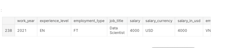
- Seems like a Data Scientist from Vietnam Working in a Medium Size Company made 4000 USD as a salary in 2021.
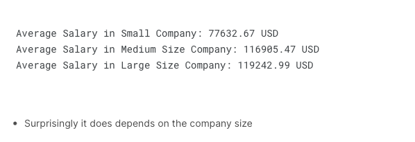
Does the Average Salary Made by the Employee depends on Company Size?
#Salary by Company Size
s = round(ds_salaries[ds_salaries['company_size'] == 'S']['salary_in_usd'].mean(),2)
m = round(ds_salaries[ds_salaries['company_size'] == 'M']['salary_in_usd'].mean(),2)
l = round(ds_salaries[ds_salaries['company_size'] == 'L']['salary_in_usd'].mean(),2)

print("Average Salary in Small Company:",s,"USD")
print("Average Salary in Medium Size Company:",m,"USD")
print("Average Salary in Large Size Company:",l,"USD")
Word Cloud for Entry Level Jobs
text = " ".join(entry_level["job_title"].values)
# lower max_font_size, change the maximum number of word and lighten the background:
wordcloud = WordCloud(max_font_size=50, max_words=100, background_color="white").generate(text)
plt.figure(figsize=(15,10))
plt.imshow(wordcloud, interpolation="bilinear")
plt.axis("off")
plt.show()