Monkey Pox EDA & Modelling
Data and Geo analysis on virulent Monkey Pox virus.
Context
- Monkeypox was first identified as a distinct illness in 1958 among laboratory monkeys in Copenhagen, Denmark
- The first documented cases in humans was in 1970, in six unvaccinated children during the smallpox eradication efforts.
- From 1981 to 1986, over 300 cases of human monkeypox were reported in the DRC, the majority being due to contact with animals.
- On 31 July 2022, the first death from monkeypox was recorded in India, a 22-year-old man who returned from the UAE died.
- src: https://en.wikipedia.org/wiki/Monkeypox#History
AIM
- This notebook focuses extensively on Data Analysis and Statistical modelling of Monkey pox cases that outbreak in 2022.
Importing Necessary Libraries
import os
import pandas as pd
import numpy as np
import matplotlib.pyplot as plt
import seaborn as sns
import plotly_express as px
from prophet import Prophet
import warnings
warnings.filterwarnings("ignore")
Reading CSV
cases_ww = pd.read_csv("../input/monkeypox-dataset-daily-updated/Monkey_Pox_Cases_Worldwide.csv",index_col="Country")
daily_case_ww = pd.read_csv("../input/monkeypox-dataset-daily-updated/Daily_Country_Wise_Confirmed_Cases.csv",index_col="Country")
case_timeline = pd.read_csv("../input/monkeypox-dataset-daily-updated/Worldwide_Case_Detection_Timeline.csv", index_col="Date_confirmation")
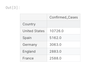
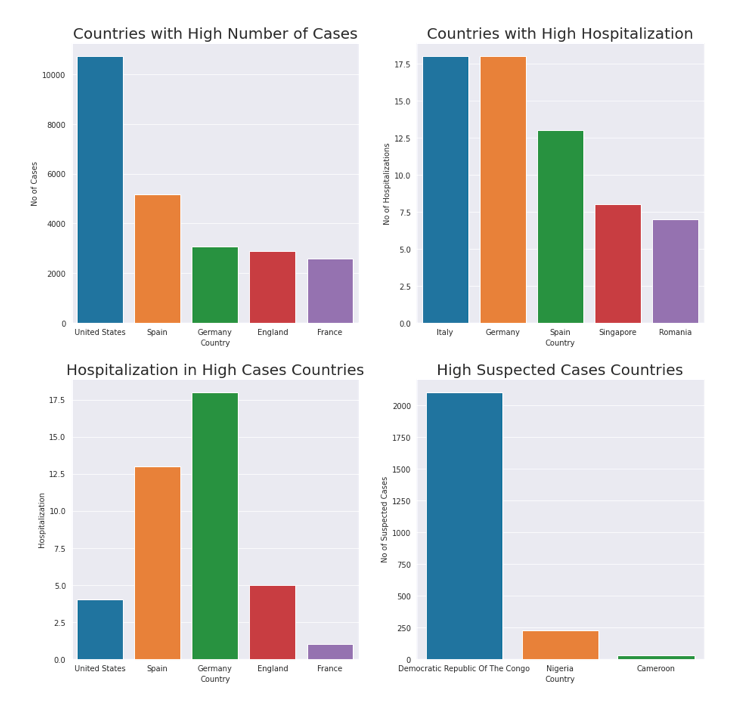
Top 5 Countries with High number of Monkey Pox Cases.
cases_ww.sort_values(by="Confirmed_Cases",ascending=False )[["Confirmed_Cases"]][:5]
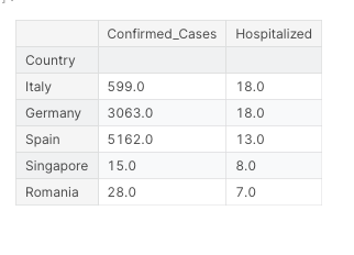
Top 5 Countries with high Hospitalization
cases_ww.sort_values(by="Hospitalized",ascending=False )[["Confirmed_Cases","Hospitalized"]][:5]
Top 3 Countries with High Suspected Cases
cases_ww.sort_values(by="Suspected_Cases",ascending=False)[:3][["Confirmed_Cases","Suspected_Cases"]]
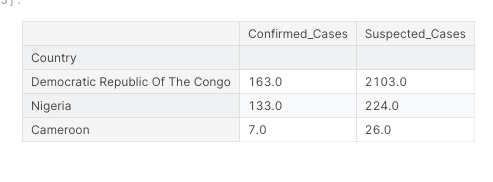
- Republic of Congo has highest number of suspected cases(i.e Not yet confirmed).
- Congo has more suspected cases than confirmed cases, might be the delay in the chain of testing.
- Nigeria and Cameroon also has more suspected cases than confirmed
When was the first case Identified?
#Extracting only the country column
case_timeline = pd.DataFrame(case_timeline[["Country"]].drop_duplicates())
print("The first case was identified on: ",case_timeline.index[1])

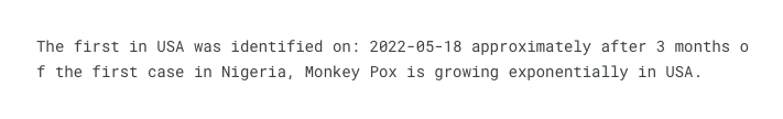
When was the first case in United States was Identified?
date = case_timeline[case_timeline["Country"] == "United States"].index[0]
print("The first in USA was identified on:",date,"approximately after 3 months of the first case in Nigeria, Monkey Pox is growing exponentially in USA.")
What Proportion of people with travel history is confirmed with Monkey Pox in USA
x = (cases_ww["Travel_History_Yes"] / cases_ww["Confirmed_Cases"]).loc["United States"]*100
print(round(x,2),"% of people")

##EDA
plt.figure(figsize=(15,15))
sns.set_style("darkgrid")

#Top 5 Countries with confirmed cases
plt.subplot(2,2,1)
top_confirm = cases_ww.sort_values(by="Confirmed_Cases",ascending=False )[:5]
sns.barplot( top_confirm.index, top_confirm["Confirmed_Cases"],);
plt.title("Countries with High Number of Cases",fontdict={'fontsize': 20,});
plt.ylabel("No of Cases");


#Top 5 Countries with High Hospitalization
plt.subplot(2,2,2)
case_hospitol = cases_ww.sort_values(by="Hospitalized",ascending=False )[["Confirmed_Cases","Hospitalized"]][:5]
sns.barplot( case_hospitol.index, case_hospitol["Hospitalized"],);
plt.title("Countries with High Hospitalization",fontdict={'fontsize': 20,});
plt.ylabel("No of Hospitalizations");


#Top 5 Countries with confirmed cases
plt.subplot(2,2,3)
sns.barplot(top_confirm.index,top_confirm["Hospitalized"]);
plt.title("Hospitalization in High Cases Countries",fontdict={'fontsize': 20,});
plt.ylabel("Hospitalization");


#Top 03 Countries with highest suspected cases
plt.subplot(2,2,4)
sus_case = cases_ww.sort_values(by="Suspected_Cases",ascending=False)[:3][["Suspected_Cases"]]
sns.barplot( sus_case.index, sus_case["Suspected_Cases"],);
plt.title("High Suspected Cases Countries",fontdict={'fontsize': 20,});
plt.ylabel("No of Suspected Cases");
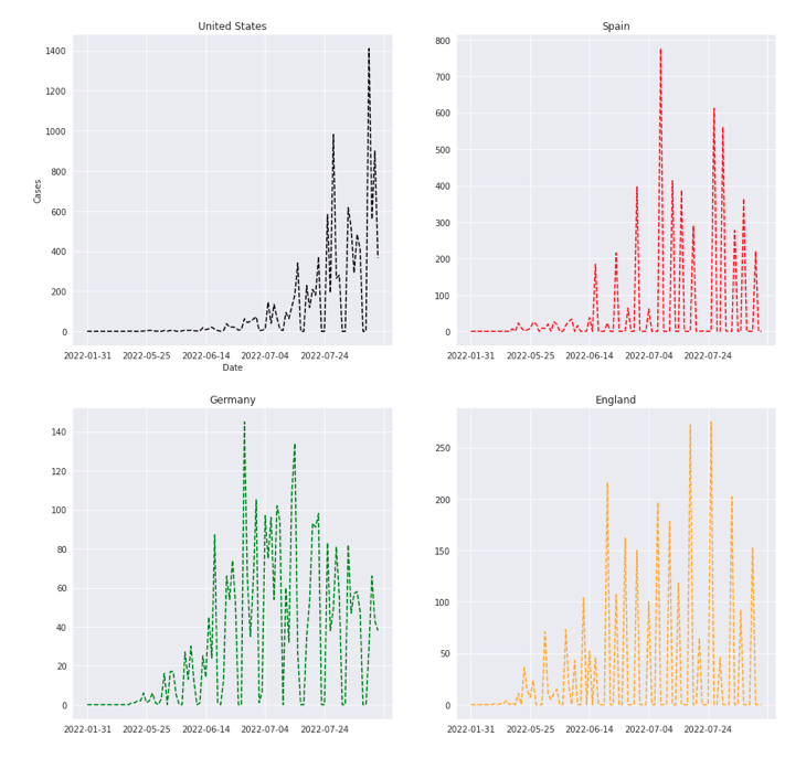
Case Trend in Top 4 High Cases Countries
plt.figure(figsize=(15,15))
#USA
plt.subplot(2,2,1)
daily_case_ww.iloc[8].plot(kind = "line",ls= "--", color = 'black')
plt.title("United States");
plt.xlabel("Date")
plt.ylabel("Cases");

#Spain
plt.subplot(2,2,2)
daily_case_ww.iloc[7].plot(kind = "line", ls= "--", color = "red")
plt.title("Spain");

#Germany
plt.subplot(2,2,3)
daily_case_ww.iloc[11].plot(ls="--",color = "green")
plt.title("Germany");

#England
plt.subplot(2,2,4)
daily_case_ww.iloc[4].plot(ls="--",color = "orange")
plt.title("England");
Total Confirmed Cases in different Continents
fig = px.choropleth(cases_ww,locations= cases_ww.index, color_continuous_scale="Viridis", scope= "africa",
                    locationmode="country names", color="Confirmed_Cases", title="Africa")
fig.show()
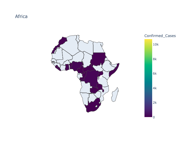
fig = px.choropleth(cases_ww,locations= cases_ww.index, color_continuous_scale="Viridis", scope= "asia",
                    locationmode="country names", color="Confirmed_Cases", title="Asia")
fig.show()
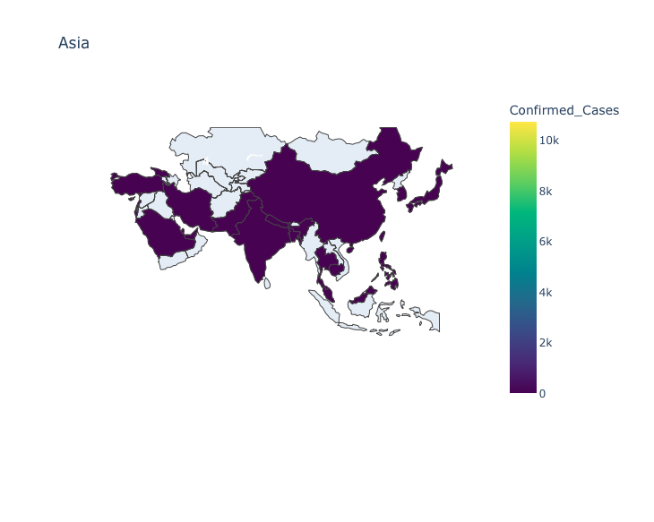
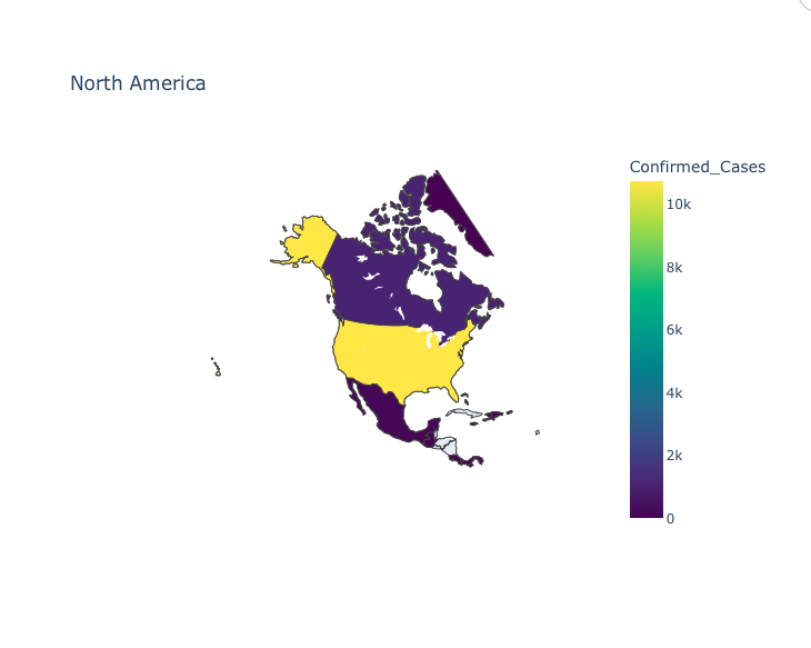
fig = px.choropleth(cases_ww,locations= cases_ww.index, color_continuous_scale="Viridis", scope= "north america",
                    locationmode="country names", color="Confirmed_Cases", title="North America")
fig.show()
Statistical Modelling
Prophet Model
- Prophet was designed by Facebook to perform time series modelling.
- More info can be found at: https://peerj.com/preprints/3190.pdf.
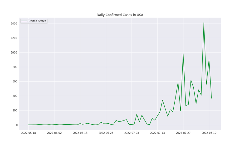
#Extracting USA and removing the before dates of the first Monkey Pox Case
daily_cases_USA = daily_case_ww.loc["United States"]
daily_cases_USA = pd.DataFrame(daily_cases_USA[daily_cases_USA!=0])
#Creating the data frame according to the algorithm instructions.
data = {'ds':pd.to_datetime(daily_cases_USA.index), 'y':daily_cases_USA["United States"].values}
df = pd.DataFrame(data)
df.head()
#plotting
daily_cases_USA.plot(figsize=(14,8), color = "green", ls = "-");
plt.title("Daily Confirmed Cases in USA");
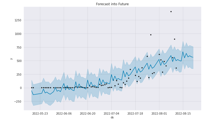
#Defining the Prophet Model
m = Prophet()
#Fitting the data
m.fit(df)
#Making predictions for next 10 future time stamps
future = m.make_future_dataframe(periods=10)
forecast = m.predict(future)
Plotting Forecast
plt.figure(figsize=(14,8))
m.plot(forecast)
plt.title("Forecast into Future");
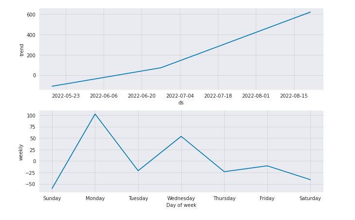
Plotting Trend Components
m.plot_components(forecast);